
Over the holidays, I was itching for a small DIY win. So, I set aside a little time for a butler’s pantry refresh. As much as it frustrates me to do double work, there were a couple of reasons why the room needed a minor update. But, before I get into that, I want to explain what makes a butler’s pantry different from a regular pantry.
A butler’s pantry is typically located between the kitchen and the dining room. It was used to stage food and store items for serving during fancy people times. It was sometimes called a scullery, which is such a fun word.
Way back when, the cooks would plate the food in the kitchen and send it to the butler’s pantry. The staff would then stage the meal and serve it to the family in the formal dining room. We use our butler’s pantry to store dishes, reusable shopping bags, and assorted junk–decidedly not fancy people business.
A regular pantry is usually near or in the kitchen. Sometimes called a larder, yesteryear’s pantry was very much like a modern pantry. It was where the family stored ingredients and dry goods for cooking. We do the same today.
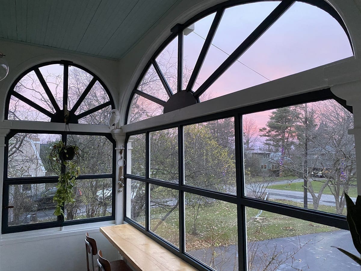
To confuse the issue just a little, the kitchen pantry in BHH also operated as a part-time butler’s pantry. The window opened out to the wraparound porch. Maids could deliver drinks and snacks to guests lounging outdoors. (BHH’s wraparound porch was removed at some point, and the section beyond was enclosed to make the sun porch.)

I am talking about the butler’s pantry between the kitchen and dining room for this post.
The Ugly Truth
The reason why I decided to do the refresh was two-fold.
First, the guest bath is located directly above the butler’s pantry, and unfortunately, during the remodel, one of the water shut-offs was bumped at some point, and there was a pin-prick drip that none of us noticed. By the time I found it, it had likely been dripping for a couple of weeks or so. I found a small water spot on the ceiling in the pantry below, and the paint on the walls bubbled and bulged.

The second reason for the update was the decor clash.
The photo below is the way before. I was not good at photography back then. The fact that I felt the need to copyright my terrible photos gives me a chuckle.

When I did the first butler’s pantry makeover in 2016, I painted everything a creamy white, removed the corner shelf unit, and stenciled the wall behind the copper sink. I also refaced the cabinet doors under the sink, but they never worked correctly. In fact, I’m pretty sure I propped them in place for the photos.

Then, when we refinished the floors in 2018, I tore the cabinet apart to fit the sander under the toe kick, and it’s been that way for four years. (four years!)
Finally, in 2019, we installed wildly printed William Morris wallpaper in the adjacent entry. I still adore it, but it’s pretty extra.

Imagine this,

right next to this

The two prints together were Clash City. They were so bad together that I never took a photo from the hallway looking into the butler’s pantry.
So, the water leak combined with the print incompatibility was enough to push me into action.
Repairs First
Before I started the repairs, I let the walls and ceiling dry for a full two weeks. The walls are plaster, but the ceiling is drywall. Fortunately, the guest bath floor was open right above the drywall, and since there was so much airflow, no mold grew. So I didn’t have to replace anything.
To fix the wall, I peeled off the paint bubbles and spread Smart Strip on the damaged sections. Then I covered the entire area with wax paper to keep the stripper damp while it worked its magic.

Some previous paint damage occurred before our arrival, so I decided to address it all at once. The wall looked like someone put latex over oil paint without a bonding primer, and the base paint layer was cracked. As a result, the wall looked like it had a shabby chic, crackle texture, which is not our thing.
After I peeled and scraped the damaged paint off, I feathered the edges smooth with sandpaper to eliminate the distinct outline of the repair.

Note: This was a patch job vs. a full restoration. For a complete restoration, I would have removed every stitch of paint from that wall to start over.
I also sanded the edges off the stenciled pattern with my mouse sander. Stenciled designs are not thick, but the edges will show through new paint if they are not lightly sanded.
I primed the water-damaged areas, but I didn’t have to do additional prep. I already cleaned, caulked, primed, and painted during the first makeover in 2016. So a quick wipe of the walls and ceiling everywhere else was plenty.
Fresh Paint in the Butler’s Pantry
Pivoting from light and airy, I chose the 2021 Sherwin-Williams color of the year, Urbane Bronze. It is a dark black/brown, similar to the Black Fox I used on the bookcases in the living room. I like that Urbane Bronze is a softer black than the background of the William Morris print in the adjacent hallway. Even though the wallpaper background is genuinely black, the fruit pattern throws brown undertones. So, the two rooms together will flow and coordinate.
Leaning in even more to the dark color, I decided to paint the ceiling, crown molding, and soffit the same dark shade. It makes the butler’s pantry a bit of a cave, but the room only serves as a pass-through for us. We don’t need it to be brightly lit to function for our family.
The color is out of my comfort zone, and I love it.
I still have so much detail painting to do in the entry hall and around the floor of the butler’s pantry. So, pretend you don’t see the mismatch if you do.

My favorite thing about Urbane Bronze is how it looks with the copper sink. Now and then, I scrub the sink with half a lemon and salt, but most of the time, we let the copper change and patina as a living surface.

After the staircase restoration is finished, I’ll turn my attention to rebuilding the cabinet doors and finishing the front entry hall.

Until then, it’s all good enough.

I would love to hear your thoughts on the color. I’ll put some lighter art on the walls and throw down a rug at some point.
By the way, happy new year! I tried to muster up the energy to recap 2021 and make goals for 2022 here on the blog, but the one word that kept coming to mind was, nope. So, instead, I am just going to put my head down, get to work, and whatever happens, happens. We’ll all enjoy the surprises together.

14 Comments
Christine
Stacy, this looks so good! I think dark colors in small spots look nice because the walls kind of fade away and you don’t notice the walls. I think this was a great way to solve the problem with the clashing wallpaper patterns.
Stacy
Thank you so much, Christine. I’m starting to feel bolder when it comes to decorating. 🙂
Miranda boucksy
I love the new color! It’s especially fun in such a small place, it gives the room a mood of its own while playing nicely with the other two that come into it.
You stenciling this room was one of the first projects I remember seeing of yours—how has it been nearly 6 years!!! Wow, time flies.
Stacy
Thank you, Miranda. I was pretty surprised that I painted the stencil wall so long ago too. Thanks for being here for so long. 🙂
marie
Wow it looks SO good ! The darker color is so interesting and I love it in this small space ! I also agree with new year resolutions and list of projects… “à chaque jour suffit sa peine” as we say in french : “a project a day is enough”.
Stacy
Thank you so much, Marie. What a good reminder in French. I will jot it down to remember throughout the year.
Denise
I love the color. It matches the patina on that awesome sink! 🙂
Stacy
Thank you, Denise. 🙂
Nicole
I love this color and it looks great here. I considered it for our living room years ago and wish I would’ve gone with it instead of what I finally chose! I find that in dark spaces with adequate lighting, the decor and details really stand out. I love it!
Stacy
Thank you, Nicole. Choosing paint is difficult, and I have some paint regrets too.
gigi
Looks very good, but I am overwhelmed just looking at the amount of work you need to do. Have you put the garage on hold since you are moving?
Stacy
Thanks! I haven’t decided about the garage yet.
Downraspberrylane
So dramatic, I love it!
Stacy
Thank you!