A few weeks ago, I asked for your decorating opinions for our main bedroom, and you delivered! It was so interesting to read your ideas here and on Instagram. Some of you took the question and ran wild with it. Others tried to make decisions based on what you thought might appeal to me. From the start, I tried not to put any limitations on your creativity even while knowing there were some things I would not do, such as replace the original tile or use certain paint colors. I should be saving this post for the One Room Challenge, but let’s enjoy it now and revisit it later instead.
This post contains affiliate links.
The Bed
Many of you suggested removing the metal piece from the top of our bed, and I agree 100%.

Removing that piece was on my list already, but getting a new bed is also a possibility. We have had this one for over 25 years. We got it when we moved into our first house. Funny story: My favorite show back then was Mad About You. Their NYC apartment heavily influenced my furniture choices. Specifically, I wanted a bed with metal on it, and this is where we landed. We could not afford the matching footboard, so we have had it attached to a metal Hollywood frame since the beginning.
I would love a bed with a headboard and a footboard. Our bedroom could handle something substantial like a canopy bed, but it could not be larger than a queen size. On the other hand, a canopy bed makes a huge statement, and it might feel a little too formal here. Clearly, I have not decided.
The Chair
There was lots of love for the chair with many calls to reupholster it.

I am also a big fan of this chair, and the current color is growing on me. Reupholstering it would be fantastic and very expensive. If I want it done by the end of the One Room Challenge, I have to start now, and I’m still waffling. Currently, I am leaning more towards keeping it as-is, and if it still fits in this room, all the better.
Curtains
Blackout curtains hung high and wide was the most popular choice regarding window treatments. Longtime reader Downraspberrylane opened my eyes to curved French return rods, and I think they could be a winner. They are different enough to be interesting to me, and they will offer the full blackout option that Andy requires.
Blackout shades were the next most common suggestion or a combo of both shades and curtains. When Andy gets his wish, I may never wake up again. It will feel like we are sleeping in a black hole.
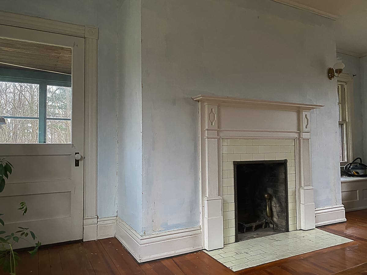
Fireplace
Several of you wanted to get rid of the fireplace screen. Truth be told, I never even considered it. It has been here so long that I do not even notice it anymore. I am super curious. What would you get instead? Let me know in the comments.

I am not attached to the screen in any way. It came with the house. I suppose something that does not protrude into the room might be better.
There were also some calls for adding drama to the mantel by painting it a different color. We’ll get to that.
Window Seat
Let’s be honest; I’m never sitting on that window seat. However, that won’t stop me from playing it up as a feature. I think it was reader Chris, who first suggested a French tufted cushion. I like that idea a lot. We have two of these on the window seat in the living room. According to my measurements, four similar floor cushions could fit very well in here.

I do sew, and I could create something custom. However, making cushions is not my favorite, and they always end up more expensive than buying them outright. I will keep thinking about what I want to do.
Paint Fun
Have you ever had a great idea, but you couldn’t make it match the picture in your mind when you attempted it? Welcome to this section of the blog post. In today’s installment of Stacy is not a Designer or a Graphic Artist, Stacy attempts to use the Benjamin Moore Personal Color Viewer to try new paint colors in the main bedroom.
My biggest beef with these visualizers is that the colors are so off. I have the paint fan deck right in front of me, and the way some of these shades look on the screen is a real head-scratcher. Most of the time, I ended up splitting the difference. I chose some colors because they match what I see in my mind, even though they vary from their paint chip color. In other words, ignore the paint color names. Choosing based on the names will result in a very disappointing outcome.
The other thing that irritates me about these paint tools is how simple they make it look to outline features such as walls and woodwork. In truth, it isn’t easy to do with accuracy. So, just pretend I nailed that part of the exercise.
Here is the photo that I uploaded to the visualizer. The only thing I did to this image was square it up. This is the natural lighting on an overcast day around 8:30 am.

In real life, Lime White is the closest match to the current woodwork color, but again, take what you see on screen with a grain of salt. Lime White is neither beige nor yellow. So weird. Anyhow…
Green
First, let’s take care of the elephant in the room. By far, painting this room green was the most popular choice, and I can tell you right now, it’s not going to happen. Ha! Even so, here’s your fix.


If you wonder why I won’t choose green, I offer this post as an explanation: No Longer The Greenest House in Town
Beige or Gray
The beige and gray contingent was hot on the heels of team green.


Pink
A few people were convinced that this room should be pink.


Blue
It’s relaxing and soothing. What’s not to love?


Drama Club
These last images are for the drama club. You are the tone-on-tone, all-in, let’s spend Stacy’s money crew. 🙂


Considering how much I loved the Thrombey mansion from the movie Knives Out, playing with those dark colors was all kinds of fun.
I appreciate everyone who took the time to weigh in. This exercise was incredibly valuable, and it helped me get out of my head and visualize our main bedroom in new ways. Thank you!
Now that you have read the post, what do you think? Also, I know I probably don’t need to remind you, but these suggestions were made by real people who have feelings, and not all decor choices appeal to everyone.


28 Comments
SH
For the fireplace screen, something flatter like: https://www.wayfair.com/home-improvement/pdp/gracie-oaks-malawi-single-panel-iron-fireplace-screen-w003169387.html
Or https://www.wayfair.com/home-improvement/pdp/gracie-oaks-malawi-single-panel-iron-fireplace-screen-w003169387.html Pricey but maybe similar ones on Wayfair or Amazon.
Instead of cushions on the window seat, place trays (like for wet boots) and fill with plants?
So excited that you are finally working on this room!
Stacy
Thanks, SH. Those links seem to lead to the thing on Wayfair. It’s a nice screen. I really like your idea about plants instead of a cushion. I’m going to kick that idea around a bit.
Jenny
My sister is obsessed with wall shades like Goodwin Green especially when paired with rich, bohemian tones like burnt orange and oriental rugs with lots of red in them (sort of similar to the color vibes from the WilfredHouse study/library on Instagram). Obviously she has a bold artistic aesthetic and her apartment is awesome.
I personally am part of the play-it-safe-with-paint club (acting president, my husband) so we have beige, greige, and pale blue walls in our house, with my youngest son’s room a shocking (to us) colonial blue. 🙂
So, all that to say that I like the Wetherburn blue walls with white mantle as a dramatic option, especially if warmed up with muted oranges and natural wood. I think that would work with your chair? It’s not as intense as the Goodwin Green but still has some drama.
For a more neutral option I definitely like the Harwood putty walls and Hale Navy mantle (or a rich black could be nice? I kinda love that high contrast, white walls/black mantle look). I think that would probably be in the winner in my house since I am more comfortable with a neutral base so I can muddle through accessories in various colors in my own time. 🙂
I love the dramatic wall colors and respect people who have the audacity to just go for it and create amazing rooms around intense colors and make it work. I wish I had the flair for it!
Stacy
I love your description of the play-it-safe-with-paint-club. 😀 I think I’m a member too!
Jenny
Oh, and I second SH’s idea about plants–that could look really nice!
Sheila Walton
I like combos of:
Geddy white, Lime white, Mkt Square
OR
Braxton white, Lime white , Geddy gray
OR
Carter gray, Tavern charcoal
Stacy
Of those three, believe it or not, the Carter Gray, Lime White, Tavern Charcoal combo is my favorite.
faellietoo
I remember reading somewhere (Maria Killam maybe?) that you never start with a paint colour in an empty room but with the things you can’t change (eg the fireplace tile) or the big expensive purchases (carpet, curtains, etc.) because it’s easier to fit the infinite shades of paint to those things than the other way around.
That said, for your bedroom I keep coming back to lots of shades of grey – either a lighter putty colour or something darker like Cromwell Grey, Knoxville Grey, Gunsmith Grey, windy City, Graphite, Onyx – because I think that room needs definition more than it needs colour.
It’s been a lovely exercise to go through – thank you for opening it up to suggestions. The end result will be fascinating.
Stacy
I agree. It does not make total sense to start with paint colors, but it is a lot of fun. Right now, I am looking for a rug.
Mimi Riley
Have you considered stripping the fireplace, do u know
if it’s beautiful wood under the paint? Maybe adding it as a wood feature in the room?
Stacy
Hi Mimi, Most of the wood in BHH has always been painted. It would be a big surprise if it were a high-quality wood worth staining and sealing. Based on my experience in this house and how it looks with paint (the mantel is super thin), I don’t think I would go through the work to find out.
Ginger
I like this fireplace screen, simple and ‘clean’, but effective. https://www.crateandbarrel.com/antiqued-brass-fireplace-screen/s198633?localedetail=US&storeid=450&a=1552&campaignid=9986587406&adgroupid=100019505999&targetid=pla-914679371974&pla_sku=198633&pcat=HSW&ag=adult&gclid=CjwKCAjw9MuCBhBUEiwAbDZ-7uz6qoswWrDkqoeVtAd0fWsSbJxxs8EoLN6omV5a3OpxvqwIlDGvfxoCh3UQAvD_BwE
I also really like the carter grey/tavern charcoal palette, and the idea of turning the window seat into a plant shelf is great! You might wait to pick exact colors until after some other major things have been selected, like a rug, but I think it’s good to have an idea of what direction you want to go with when searching for said rug. I have always seen paint as one of the least permanent things about a room, at least wall paint – windows and other things are more of a pain to switch out. 🙂
Stacy
I really like that fireplace screen. Thank you for the link! A flat fireplace screen really seems like the way to go. As for the paint, you’re right. It will be easier and better to choose after I have some of the high-ticket items chosen.
Anne at Large
I love the Wetherburn blue but I like the idea of it with the white mantel matching the trim instead of the darker blue mantel. I think that combo would be a stunner with a richly colored Persian-style rug and a lower profile fireplace screen.
Regarding the bed frame, have you considered a sleigh style headboard/footboard? I think it would be nice and grounding and not as obtrusive as a canopy.
Can’t wait to see your choices, this is so fun to follow along!
Stacy
I am having such a good time daydreaming and planning. In my mind, a sleigh bed is pretty heavy. However, I will take a look. With the new curtains, I am trying really hard to keep this room from turning into a cave. Even if it isn’t technically light and bright, I want that to be the feeling I get when I am in the room.
Holly R Layer
Carter gray!!!! It really sets off the trim…Not sure I love the darker mantel. Also, LOVE the plant idea.
Stacy
Thanks, Holly! 🙂
Chad
I’m glad we added dark colors in our bedroom. Even though they’re not all over, they made it cozier and more interesting. Of course if you add curtains and other things you can do that if you keep the walls light. I like the dark colors on the mantel only also.
Will you ever use the fireplace? If not, you could just take the screen away.
How will you deal with the door and the window that’s over the seat? You might do well to have shades on them. I also like shades because if we open the windows I can pull them up a little bit.
And I wouldn’t worry about a canopy bed being too formal. I was afraid of the same thing when I saw a Kittinger camelback sofa at a price I couldn’t refuse; traditional furniture with simple lines is easy to dress down. It’s also sometimes really cheap on the after-market. I believe in being snobby about that kind of furniture since it’s not as hard to find cheap as modern furniture, and would look for a really good pencil post bed, and if it’s too much use it without the tester.
Stacy
These are all excellent tips–especially about the bed. I haven’t even started looking for one yet. To answer your question about the fireplace, I don’t know. It’s totally usable since we had the chimney rebuilt, but it’s not a high priority. What I really want is a gas log. It’s on the list.
Andy
Or…
https://www.litfad.com/dark-color-steampunk-wall-mural-full-size-metal-effect-wall-decor-for-house-interior-s-417791.html?language=en¤cy=USD&gclid=EAIaIQobChMI7Yzb86O77wIVguazCh1vJA7fEAQYASABEgLcefD_BwE
Jennifer Quinlan
I agree with cutting the metal off the bed and paint the headboard black. Paint the fireplace screen black too. I think BM super white on all the time and mantel. Your sheets are still Dune? A duvet like this? And you can paint the walls the blush in the fabric. Oh, so calming and pretty and still so interesting with enough contrast to keep it clean looking. https://www.nordstrom.com/s/marimekko-pieni-letto-duvet-cover-sham-set/4766633?color=MULTI&mrkgadid=3313915877&mrkgcl=760&mrkgen=gpla&mrkgbflag=0&mrkgcat=&utm_content=9386043233&utm_term=pla-70090533833&utm_channel=low_nd_shopping_standard&sp_source=google&sp_campaign=646357586&adpos=&creative=57224586353&device=c&matchtype=&network=g&acctid=21700000001689570&dskeywordid=92700049880196148&lid=92700049880196148&ds_s_kwgid=58700005470150128&ds_s_inventory_feed_id=97700000007631122&dsproductgroupid=70090533833&product_id=13822397&merchid=1243147&prodctry=US&prodlang=en&channel=online&storeid=&locationid=9021569&targetid=pla-70090533833&campaignid=646357586&adgroupid=9386043233&gclid=CjwKCAjw9MuCBhBUEiwAbDZ-7sLbNGyR5mdkVPnIrAWc-rjdN6I95LjJTLR96hPDLSotTIJVtCcMHxoCUDkQAvD_BwE&gclsrc=aw.ds
Stacy
Thank you for the ideas! Luckily, the metal is just screwed to the wood. It will be easy to remove it. 🙂 Also, to answer your questions, my sheets are still Dune from Boll & Branch.
Christina
I love playing around with the paint colors. I agree about never starting with the paint color, but playing around can give you ideas and help focus your search on a rug or bigger items. There are so many options these days!
I loved the fireplace painted a contrasting color. My 2 favorites were the ones with the Everard Blue on the FP.
We have a pencil post bedframe and it gives a good amount of drama without it overwhelming our small bedroom the way a canopy does. That said, you could do a canopy and install curtains and truly give Andy the cave effect he so desires, haha. I also need complete darkness to fall asleep, so I feel his pain.
If you install curtains, I always use rings with hooks because then I can add an eye-hook to the wall just under where the rod ends and have the curtain close to the wall. It’s how the professionals do it, and further seals light from the room. I believe it’s called a return.
https://laurelberninteriors.com/wp-content/uploads/2016/03/26-17964-post/Screen-Shot-2016-03-26-at-2.14.45-PM-e1459036777169.png
Can’t wait to see where you end up!
Stacy
Thanks for that extra info about curtains. Adding an eye hook is an excellent tip. Over the weekend, I showed Andy a pencil post bed, and he is not a fan, unfortunately.
Downraspberrylane
I saw this today and thought of you. I personally prefer the mantle to match the other trim in the room, but I love this wall color with the black too,
https://www.instagram.com/p/CMkTc1an7NE/?utm_source=ig_web_copy_link
Stacy
Very elegant! Thank you.
Anne at Large
“With the new curtains, I am trying really hard to keep this room from turning into a cave. Even if it isn’t technically light and bright, I want that to be the feeling I get when I am in the room.”
I do not seem to be able to reply to this directly but keep in mind even if you do a combo of blackout shades and blinds you can still get light colors with a light blocking backing – you could do a lighter white or cream based fabric that would echo the trim color but not make the room feel like a cave even though they are blackouts. Same with a roman blind or bamboo or whatever, if you did a roller blind under the fabric drapes with a nice light tone of, say, bamboo, you can still lighten up the feel without sacrificing Andy’s need for a cave to sleep in. Can you tell I have spent a lot of time thinking about room darkening options?
Stacy
Thank you, Anne! Light-colored curtains and blinds do feel like the way to go, so the room doesn’t feel heavy and dark.